What features should a good website have? [Update 2020]
Having a website for every business has become a basic requirement nowadays. While the whole world has witnessed a surge in the economic crisis due to the pandemic, businesses with great online presence have managed to survive. This is possible by reaching out to the customers by rendering products/services through a website.
It’s never too late, you can also get a website created for your business by hiring a web design agency. A good agency will help you in creating a website with a structured roadmap keeping it abreast with the current market trends. They will guide you about domain registration and hosting a server. They will also help you in selecting a website template of your choice. There are some characteristics that every good website must have, and you can check out a web design agency as well that provides you all these features for a website they create for you.
15 Facets for a successful Website Creation
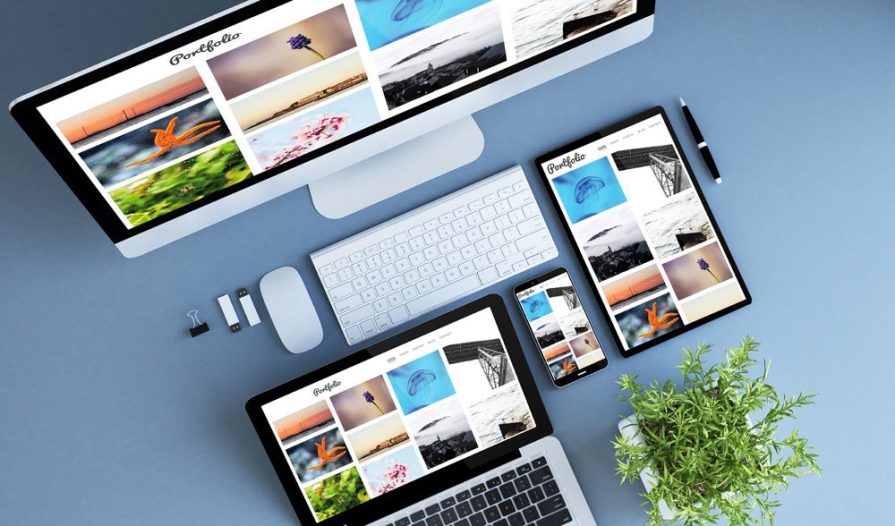
1. Website should be Compatible with Mobile Devices
Today audiences have their virtual homes online which makes work a lot more easier for Businesses to target & connect. It’s all about ease of access at finger tips, and it’s a known fact that 99% of people out there rely on their mobile phones to go on a shopping spree, quench their midnight cravings, pay rents…. The list is virtually endless!
This calls for the need of making Websites mobile friendly. 75% of Website traffic gush in through mobile devices thereby doing wonders for online business portals. A mobile friendly website not only captivates audience attention, but also gives the website a competitive edge through better browsing experience , ease of navigation, quality and trustworthiness.

2. Website must load within 3 Seconds
What’s the use of all the loud colors, if the loading time is poor. The curtain’s up and the audience? Zilch!
Customers are not quite known to have AMPLE PATIENCE! You overfeed your website, you loose!
The ideal loading time for a website should be 3 seconds or less and this heavily depends upon the layers of layouts, content, images and the videos you put up there. Page load time is something Google eye on to determine search engine ranks. Websites bedecked with an overdose of graphic designs, pictures and excess content, can drastically impact on the loading time, thereby increasing the bounce rates to around 10-15 which in turn annoys customers and provokes them to leave the website in a click and never return. Optimizing the page load time not only enhances the browsing experience, but also helps in easy navigation, improves conversions and google ranks.
3. Website should be Compatible to all browsers
There’s no doubt about it at all that Digital platforms have taken businesses up a notch through its diverse avenues.
Talking about diversity, Have you ever tried accessing Websites from different browsers but you end up being dissatisfied with some of them? You might come across certain situations, where 1 or 2 features might not work in all. That’s because there are certain Tech aspects we’ve got to look into. It’s very important for Websites to have cross browser compatibility to give the users hassle free and a seamless browsing experience. With cross browser testing, the user gets to access the website the way it is from all kinds of browsers, be it Google Chrome ( The all time favorite), Firefox, Opera, Safari etc. without any hurdle. Browsers of all kinds function differently. For example, one or two features of a website might work well on Google, but not on Opera. Some of the ways, that improves browser compatibility is by:
- Setting up a “Doctype” that notifies the browser about the html version
- Using a “CSS reset” to set rules which in turn improves access across different browsers.
- The use of frameworks such as Bootstrap & Foundation that are built to make websites a lot more compatible with different browsers.
4. Website must have easy navigation
Easy Navigation is an essential ingredient for a website because it’s the ultimate guide for a customer. You really don’t wanna see your customers go heywire fetching for something and they end up saying, Ah! Forget it, I’m leaving! There’s no use of color, creativity & unique Website layouts if the navigation is vague. Keeping a website navigation crystal clear not only makes customers happy but also persuades them to return for more. The breadcrumb trail tells a lot about the structure of a website. The navigation bars should be simple, clear and present throughout the website while touring. This in turn will give the visitors a clear indication of what to find where. Remember, fewer the complexities, longer the time they spend on a website.
5. Website should have search box feature
Imagine you’re on an e-commerce website and you yearn to buy this cool sweatshirt, what would you do? Would you rather head towards the search box or scroll down to the links? Duh! You’d definitely hit the search box to type in the specifics. A search bar plays a very vital role in a website, it’s a space where you’ve got to be straight and clear. Once you type in the correct name of the product/service it takes the customer to the right spot in a click. The use of search bars brings in ease as you can access it both from Laptops & mobiles. The autofill feature in search bars not only tells about the specifics available, but also elevates the speed of the search thereby avoiding incorrections and enhancing user experience.

6. Website must have custom 404 pages
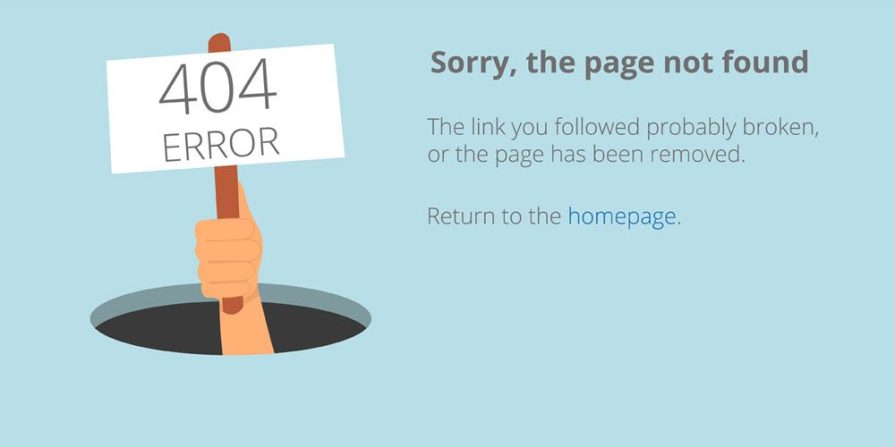
Have you ever wanted to visit a website, but then a page pops up stating “ ERROR 404: PAGE NOT FOUND” What does that mean?
An “Error 404: Page Not Found” mainly pops up when the user enters an incorrect extension to the web address or tries visiting an old page. It’s actually an HTTP Status code that notifies the visitor to stay on the page even if he/she ends up on an 404 error page, but just like we mentioned earlier, customers are not quite known to have patience, they see an error page, they quit. Error 404 is like a funnel that leads visitors from the error page to another page with the right and relevant information. But how do we add value to Error 404 pages? Customizing the error pages, like for eg, adding a search bar, adding your blogs, a Wikipedia, a contact page etc. These elements not only add value to the page but also reduce bounce rates as visitors tend to stay on the page for a whole new purpose.

7. Website should have internal linking
Internal links help users navigate around the website easily. Remember, do not bore the visitors with jargons! A simple & neatly set hierarchy of internal links guide the visitors in the right path and pours in a lot of goodness for a website in terms of crawling & indexing which does wonders in Google Ranks, reduction in bounce rates, which means the amount of time spent on the website by a user, (Getting the readers hooked to relevant information about your websites is an important aspect that matters. The more valuable your content is, the lesser the bounce rates.), Insertion of relevant keywords signals Google about the relevancy of the page thereby directing the audience to the respective site and winning big at the search results.
8. Website must contain informative header and footer
The header and footer are like the key essentials of a website. The Header marks the beginning and gives a wholesome meaning of what the entire content is all about. The heading is something the viewers will eye on before diving deep into the content as it sparks a connection between what the user wants and what’s present right in front of him/her. Ensure your header is complete and catchy so that the viewers get a whiff of uniqueness, A logo that’s clickable, so that it takes you back to square one and of course the contacts! You can’t expect to get those from thin air!
The Footer is equally important. They’re more like persuasions in the form of Call-To-Actions, links that can add more value for a customer like customer services, About info, social media sites etc.
9. Website must have right colour contrast
A visually appealing website is something that captivates and marks an impression on the viewers. The color and fonts spread a sense of quality and the brand personality. We should be very careful while choosing the color for a website. Throwing loud colors at your website can certainly bring you down if the website doesn’t serve the purpose. You certainly don’t want your viewers to exert pressure and strain their eyes to read a word. There are rules for obvious!
- The logo or your brand color should be a dominating one, which symbolizes USP of the business,
- Awesome threesome! It’s always recommended to use 3 different kind of colours or less rather than painting a rainbow
- Colors should be neutral, like fonts in dark with a mellowing light background which makes the words clear and crisp to read.
10. Website must have enquiry forms with validation
Enquiry forms are like the ultimate virtual meeting points for a business and a customer. These forms come in the form of “Contact Us”, “Sign Ups” basic information like, name, address, number and email ID. Without these essentials there’s no way you’re gonna get the leads. Filling these blanks, should be made compulsory so that it can be easier to answer the queries. Once the enquiries are sent, it exits with a “Thank You” page then reverting the user saying “We’ll get back shortly on your query” and that’s how the cycle goes.
11. Website must contain accurate business information
Preciseness is something viewers look for in a website. The content that describes the venture must be short, crisp and to the point so that it serves the purpose of a user. A saga is definitely not something we want for a website as this can disappoint the users and provoke them to exit the page. The source matters a lot! Ensure you add reliable sites to the websites that give relevant information to the users. Pop-up windows are something that gets on to the nerves of the users. The motive of a website should be to give accurate information rather than overpowering with advertisements. And last but not the least, avoid misspellings or grammatical errors as it contributes a lot to the health of a website.
12. Website must contain proper contact information
This point needs no further emphasis because contact information is an absolute essential for a website without any doubt. If the customer is willing to drop in some suggestions, he/she can easily get in touch with you using your email ID or ring you up for queries. The contact factor is the ultimate funnel that brings in leads for a Website. It keeps your website safe and secure by the use of Contact form plugins.
13. Website must be secured
When you talk about threats, the first thing that pops up in your mind is “Hacking” something you’ve got to be very careful about. There are various kinds of malwares spread out that can bring your website down. Google is known to warn the websites through search console about the alarming number of problems that hit a website everyday. If your website lacks a blanket of security, these websites can be misused illegally by targeting the audience and cause them harm.
The use of firewall, and manual malware cleanups prevent websites from being attacked thereby keeping them safe and secure.

14. Website should have Social Media profiles integration
Social Media plays a very crucial role in the life of a business and it’s one amongst the main sources that contributes a lot to the success. Audiences who are often satisfied with the quality of the products/services aren’t quite done just by raving about products or just liking a picture, they would love to take a frantic search on the Websites that’s been showering such goodness for more! That’s one big reason that Businesses must link social media profiles to their site, as it brings in more visitors amongst which, half of them might turn up being your paying customers, Two, it does wonders in Google Search Rankings, thereby helping the viewers understand the relevancy of the Website when they type in a query. Last but not the least, Trust, to gain that trust from a customer, you’ve got to be raw & real. Your USP is what makes you different from others. So to make it to the hearts of the customer, you’ve got to be authentic at the same time, offer something that adds more value.
15. Website must contain FAQ
FAQs are like the next best thing that helps the viewers navigate around the Website. FAQs with links, not only prod the users in the right direction, but also enhances the user experience. They fall under Google’s favorites because they shoot clear & straight answers which are often shown in the featured snippets as you see these days in the search results, which in turn brings in more traffic. It improves customer service interactions. Even miniscule changes in the product/service must be highlighted, thereby keeping the users updated.

Sources
https://wpengine.com/resources/website-browser-compatibility/
https://www.lambdatest.com/blog/how-to-make-a-cross-browser-compatible-website/
https://www.hobo-web.co.uk/your-website-design-should-load-in-4-seconds/
http://onlineincometeacher.com/traffic/need-search-bar-website/
https://www.ionos.com/digitalguide/websites/website-creation/what-does-the-404-not-found-error-mean/
https://unamo.com/blog/seo/focus-internal-linking
https://websitesetup.org/website-color-schemes/
https://www.tourcms.com/support/webdesign/enquiry_form.php
https://smallbusiness.chron.com/make-sure-information-accurate-29521.html
https://wpforms.com/8-reasons-why-you-need-a-contact-form/
https://www.webarxsecurity.com/5-reasons-website-security-important-2018/
https://www.seoptimer.com/blog/social-media-links/
https://www.websolutions.com/blog/9-reasons-your-website-needs-an-faq-page/
Disclaimer: Honeycomb Creative Support and its brands make no representations or warranties about the accuracy or suitability of any information in the webinars, blogs, articles, handouts, presentation documents, and recordings; all such content is provided to email recipients on an “as is” basis. Honeycomb Creative Support (P) Ltd, and Its brands. HEREBY DISCLAIMS ALL WARRANTIES and Conditions Express Implied Statutory or Otherwise REGARDING THE CONTENTS OF THESE MATERIALS, INCLUDING WITHOUT LIMITATION ALL WARRANTIES OF TITLE, NON-INFRINGEMENT, MERCHANTABILITY, AND FITNESS FOR A PARTICULAR PURPOSE. Honeycomb Creative Support (P) Ltd, and Its brands, is not liable for any claims, losses, or damages of any kind arising out of or in any way related to this information provided.


