

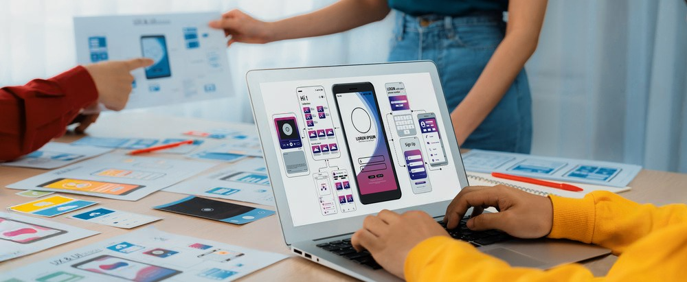
India’s mobile-first audiences aren’t just expanding—they’re evolving. From watching and purchasing to learning and paying, mobile apps are now part of the fabric of daily life. In today’s always-on world, mobile app design is not just a technical design—it’s a living, breathing language. One that communicates through color, shape, and motion to lead users, build trust, and connect with experiences that feel natural and seamless.
While functionality is the backbone of any app, what usually turns an app from great to great is how it resonates with people on an emotional level. That emotional resonance often begins not in code or copy, but in color. Say hello to color psychology—the understanding of how color influences perception, choice, and behavior.
In this blog, we are talking about how applying color psychology principles to the design of a mobile app will make the experience better for users, raise engagement, and influence consumer behavior. Let’s delve into the art of choosing colors with feeling and intention.
Decoding Colors: Psychology Meets Design
All colors have meaning. And when it comes to mobile app design, it’s not just about what looks good—it’s about what feels good. The goal isn’t just to make a screen look pretty, but to drive user behavior through visual storytelling. Let’s deconstruct the emotional motivators behind the most employed colors in mobile apps:
- Red: Urgency and Action
Red is a color that demands attention. It conveys a sense of urgency and action, which is why it’s often seen in flash sale notifications, error messages, or critical alerts. When used in moderation, red can create moments of high impact and urgency within an app. It’s particularly effective in mobile app designs where rapid decision-making is required, but overuse can create anxiety or visual fatigue. - Blue: Trust and Confidence
Blue is an in-app default to use for handling sensitive or private information. Financial apps, wellness apps, or business productivity apps are what often come to mind first. Blue radiates serenity, worthiness, and stability—providing an impression that consumers are in trusted hands. Login screens, transaction confirmation screens, or top navigation bars generally use blue to convey trust and expertise, which is important with mobile app design. - Green: Positivity and Progress
Green is often used to symbolize growth, progress, and success. In checkmarks in task managers to savings visualized in financial apps, green adds a sense of accomplishment. It is also used in nature or health apps in order to connect with nature and sustainability themes. In multicultural markets like India, green can also be used to signify prosperity and good fortune, providing an emotional positive boost to your app. - Yellow: Attention and Optimism
Yellow is all about getting noticed and radiating joy. It’s heavily employed in app tours, marketing banners, or feature highlights where a quick visual pick-me-up is needed. Due to its vibrancy, however, yellow fares better when combined in contrast against neutral colors to prevent overwhelming the senses. Used wisely, however, yellow will inject fun and simplicity into mobile app design. - Orange: Warmth and Encouragement
Orange introduces energy without red’s urgency. It’s encouraging and inviting, frequently used in applications to spur action or lead users through onboarding. Whether a “Get Started” button or a reminder of progress, orange achieves a welcoming tone and drives positive momentum. - White: Clarity and Space
White—or negative space—serves as the breathing room of design. It serves to make content pop, increase readability, and assist in producing a clean, modern interface. In feature-laden high-functionality apps with much to display, using white can also assist in making users feel less bombarded and more focused. - Black: Sophistication and Focus
Black brings sophistication and seriousness. It’s often used in luxury or minimalistic app design, especially when paired with clean type and high contrasts. Black is used to outline content and delimit areas of focus, giving the interface a smooth and high-end appearance.
How Color Affects Behavior in Mobile App Design
The real power of color does not manifest in a stand-alone landscape, but in how it is used throughout the entire app journey. In Mobile App Design, color is more than decoration—it’s a tool to guide, to support, and to evoke emotions.
- Guiding Navigation
Color helps create a visual hierarchy, which itself is supported by intuitive navigation. For example, duplicating the strongest call-to-action (CTA) using the same color supports recognition and builds predictability into an experience—again, in a good way. Unconsciously, users start to recognize what to do and where, thereby building an experience easier to travel through. - Creating the Emotional Tone
From a calming meditation app to an energetic delivery tracker, the color scheme establishes the emotional tone for the entire experience. A well-considered palette reinforces your brand voice and lends personality to your app. It’s not about how the app looks—it’s about how the app feels. - Communicating Function and State
Colors like green for success, red for warnings, and grey for disabled states are intuitive visual signals. They reduce cognitive load and allow users to understand status or feedback immediately. This becomes more important for onboarding new users or catering to audiences that are less tech-savvy. - Subtle Decision-Making
Even the most elementary, such as a button color, can influence one to click or not click. Orange and green are used regularly for behaviors like “Next,” “Confirm,” or “Order Now” because they are inherently stimulating. When combined with quality microcopy and rational positioning, color can urge users toward desirable behavior.
Designing with Purpose
Color is not an afterthought in mobile app design. It’s a grounding layer that merges function with feeling, form with flair. When used with intention and restraint, it guides users, influences decision-making, and adds to the overall product experience.
Especially in a market as multicultural, fluid, and competitive as India, apps need to be more than just functional. They need to be intuitive and human. That’s where thoughtful design comes in.
We at Honeycomb believe that good design is not only how something looks—it’s how it resonates. We work with up-and-coming brands to create mobile experiences that are as beautiful as they are behaviorally effective. From launching new ideas to refining an established product, we’re here to help you design with intention—one color, one emotion, one interaction at a time.